1. Summary
- Keep Clear slogan, three programs, team page, LinkedIn posting
- Fix now Search files + make pages readable without JavaScript
- Align Naming + type weight + LinkedIn format mix
2. Scorecard
Hover or tap a row for the plain-English detail.
| Area | Score | Plain meaning | |
|---|---|---|---|
| Message / positioning | 8 | Strong | Easy to understand what you sell
Score 8 · Strong
The pitch is clear
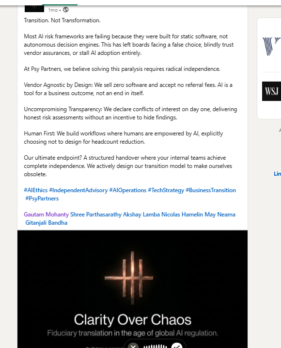
“Transition. Not Transformation.” tells a board what you do in one line — vendor-agnostic AI transition, not generic consulting. So what: Keep this. It’s already working hard for you. |
| Programs on the site | 7 | Strong | BoardGuard / Transition / Velocity exist
Score 7 · Strong
Three real offers, not vague “AI services”
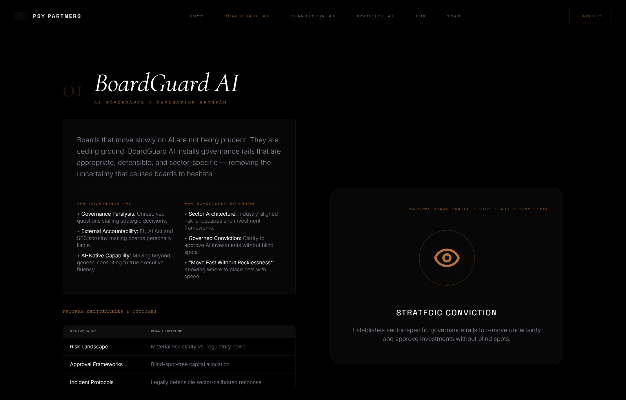
The site has named pages for BoardGuard AI, Transition AI, and Velocity AI — each with a buyer and an outcome. So what: Good structure. Next step is proof on those pages, not more products. |
| Name consistency | 3 | Broken | Site names ≠ LinkedIn acronyms
Score 3 · Broken
Two different product languages
Website: BoardGuard · Transition · Velocity Same funnel, different labels. A board member who clicks a LinkedIn post won’t know if “AFP” is BoardGuard. So what: Pick one naming system everywhere — or show both with a clear map. Confusion kills conversions. |
| Google / SEO setup | 2 | Broken | Search engines get the wrong files
Score 2 · Broken
What “wrong files” means
When Google asks for Also: without JavaScript, the page body is empty — so some crawlers see no words. So what: Google can’t reliably map or read the site. Fix hosting routes + prerender before buying ads or SEO tools. |
| Being found on Google | 1 | Weak | Almost no web footprint yet
Score 1 · Weak
You’re hard to discover outside LinkedIn
The domain is ~5 months old. Public search mostly surfaces the homepage and LinkedIn posts — little else. So what: Don’t expect inbound leads from Google yet. Relationship + LinkedIn carry BD until crawl fixes + proof pages land. |
| LinkedIn writing | 7 | Strong | You post often with a clear POV
Score 7 · Strong
The content muscle is real
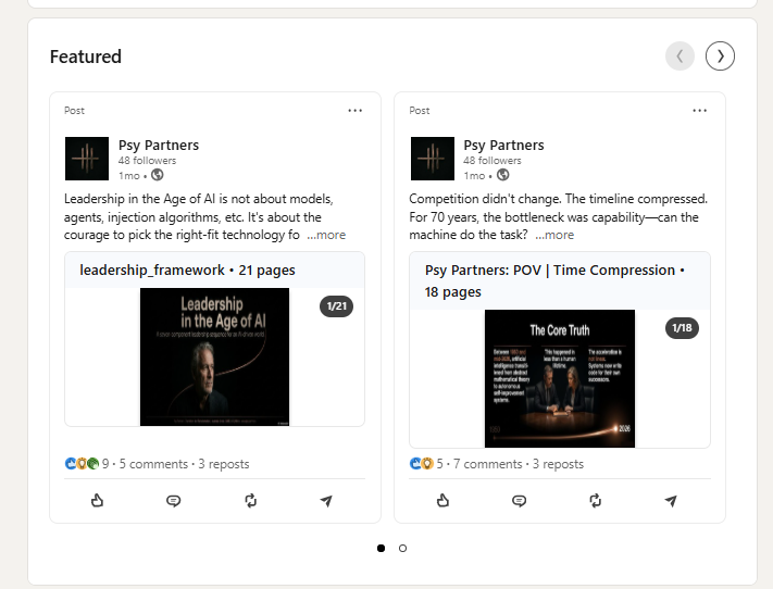
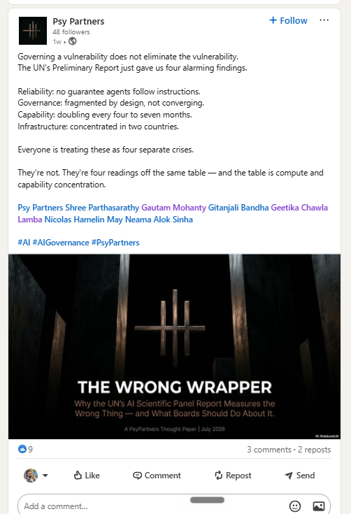
Started ~3–4 months ago with partner-circle reposts (Rio AI / Akshay / ALRigs). Now mostly original Psy long-form: governance, K-economy, Transition not Transformation. Strong ideas; packages are often too long for the feed (17–21 page decks). So what: Keep the thesis. Shorten feed packages (≤10-slide carousels + hooks). Put full papers on the site. Partners post from personal profiles. |
| LinkedIn audience size | 2 | Weak | 48 followers — still early
Score 2 · Weak
Small room, strong engagement ratio
48 company followers. Recent posts still land single-digit likes — but comments/reposts are decent for that size (partners amplifying). So what: Partners post on personal profiles first; company page reshare. Don’t wait for the company page alone to grow. |
| Look & readability | 4 | Risk | Thin italic text on black is hard to read
Score 4 · Risk
Looks premium; reads poorly
Thin italic headlines and small low-contrast body text on black feel “AI template,” not board-room clear. Nav links are also too thin to hit comfortably. So what: Medium-weight headlines, near-white body (~16–18px), larger nav. Fancy type that can’t be skimmed costs trust. |
| Proof (cases / logos) | 5 | Partial | Team is good; client proof missing
Score 5 · Partial
People yes — outcomes not yet
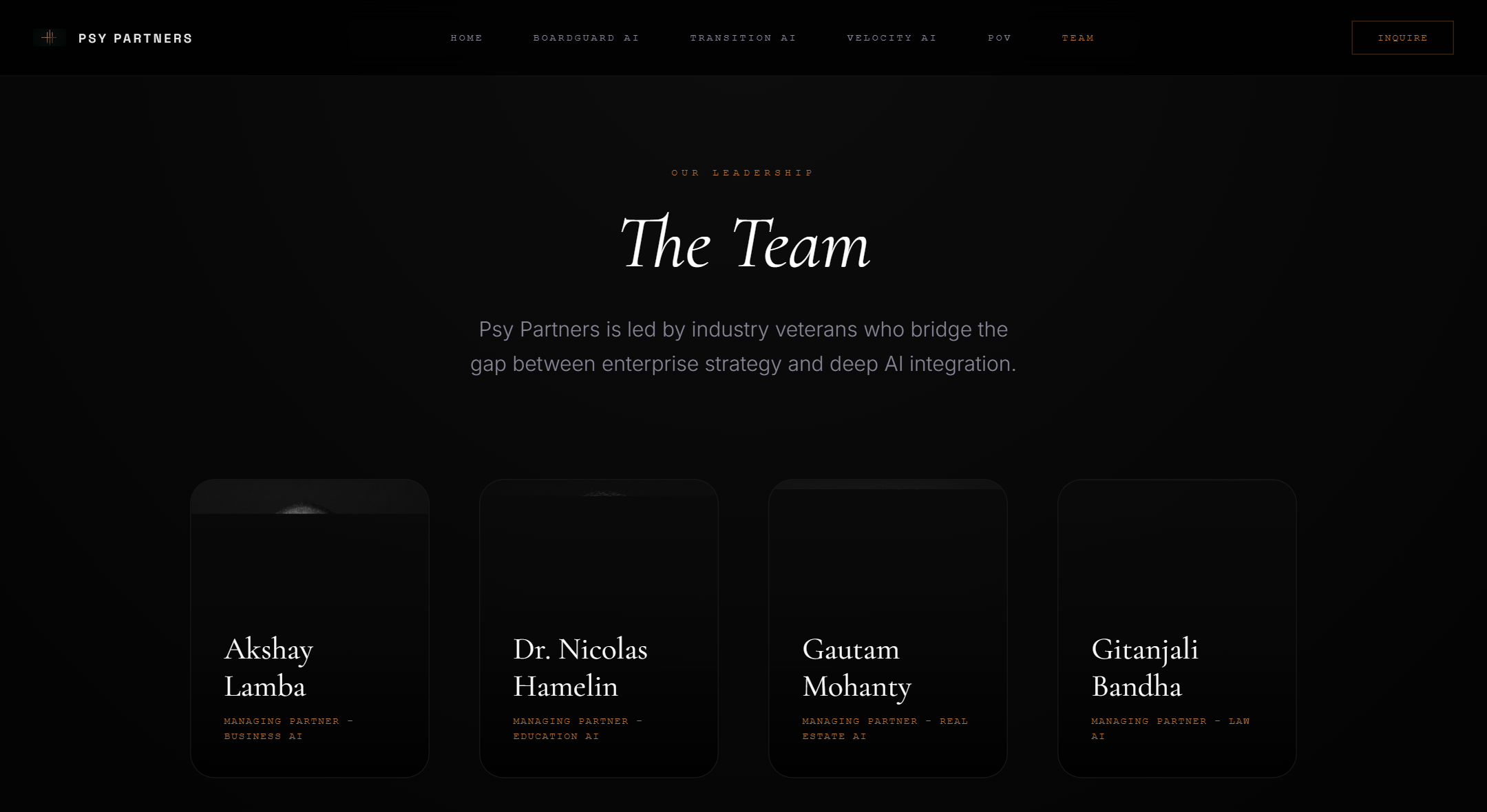
The Team page names partners (good). We didn’t see client logos, case studies, or named board outcomes on the public site. So what: Add 2–3 proof pages (even anonymized). Claims like “40%+ velocity” need something tangible beside them. |
3. What’s working
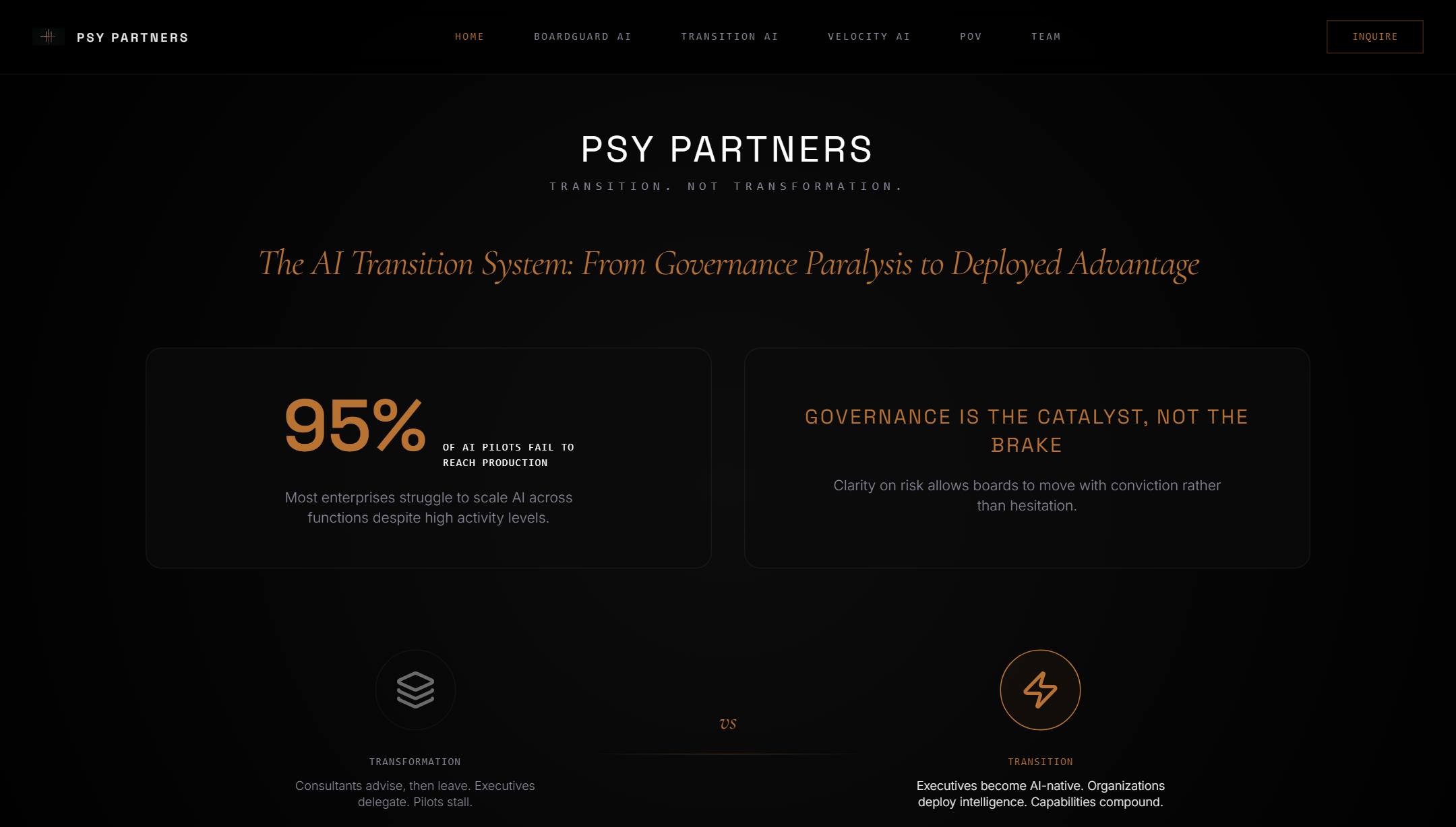
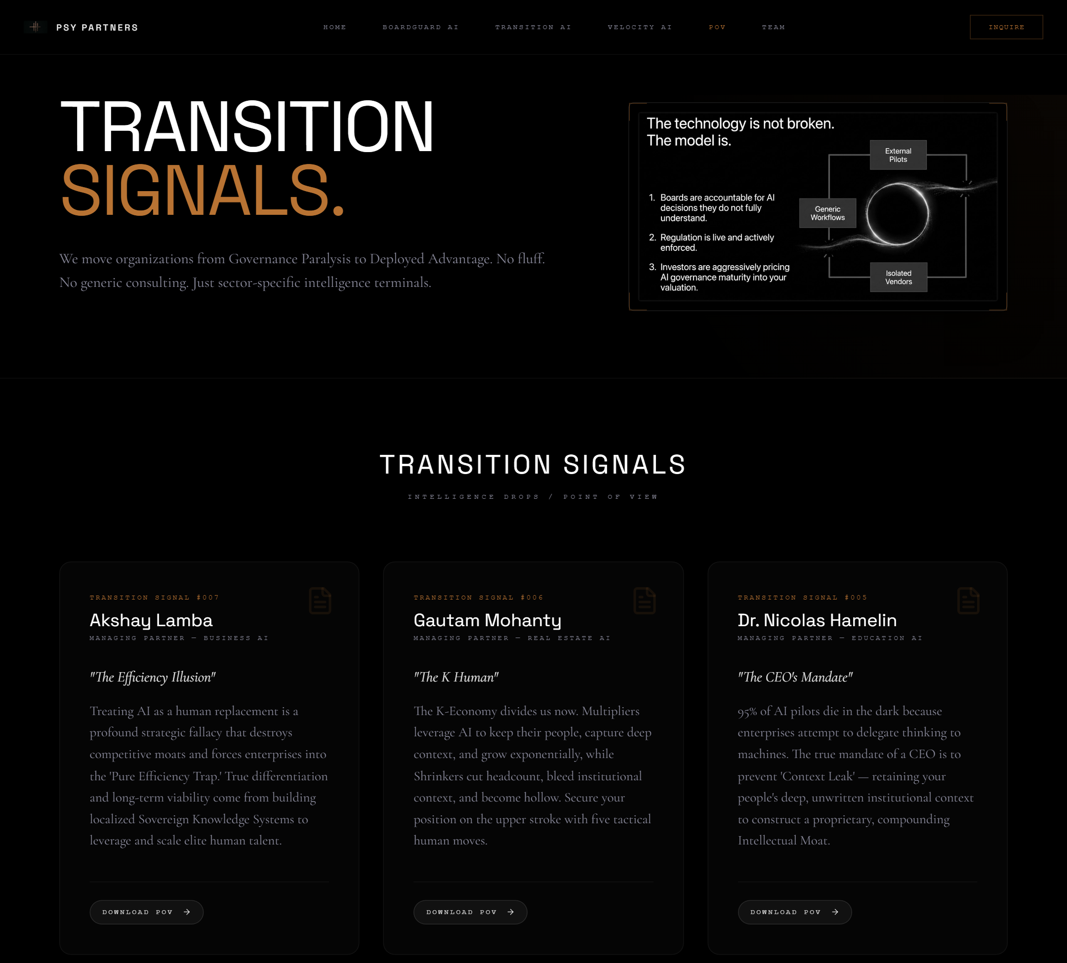
Clear story, real pages for each offer, named partners.
4. What’s broken
robots.txt) or your page list
(sitemap.xml, the site sends a full webpage instead.
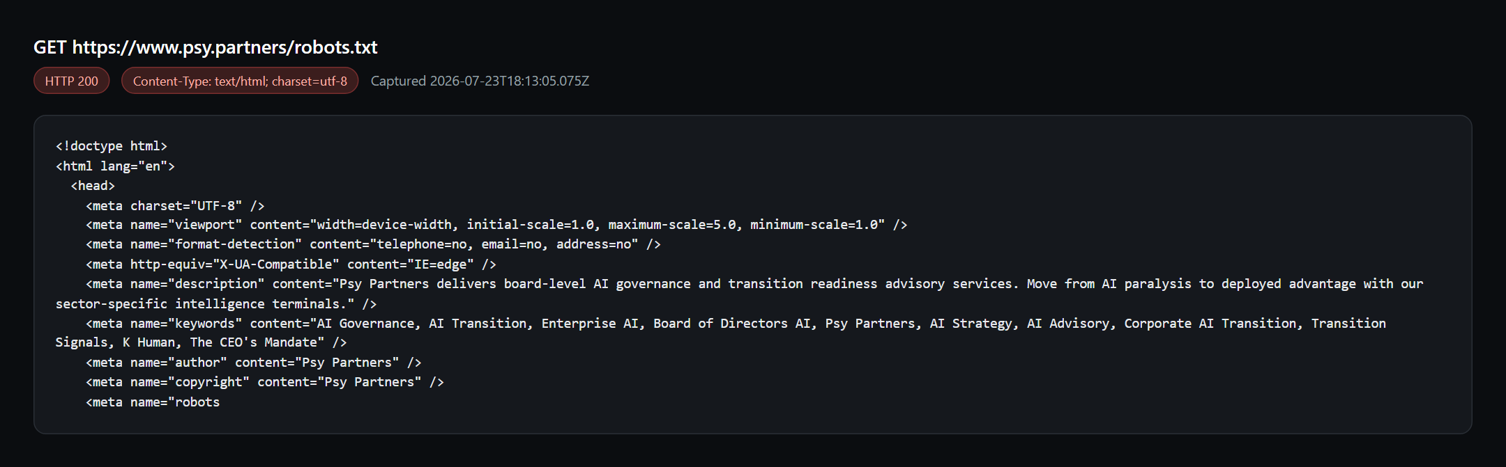
/robots.txt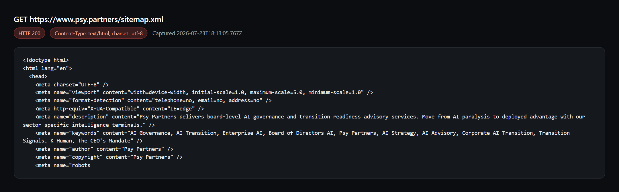
/sitemap.xml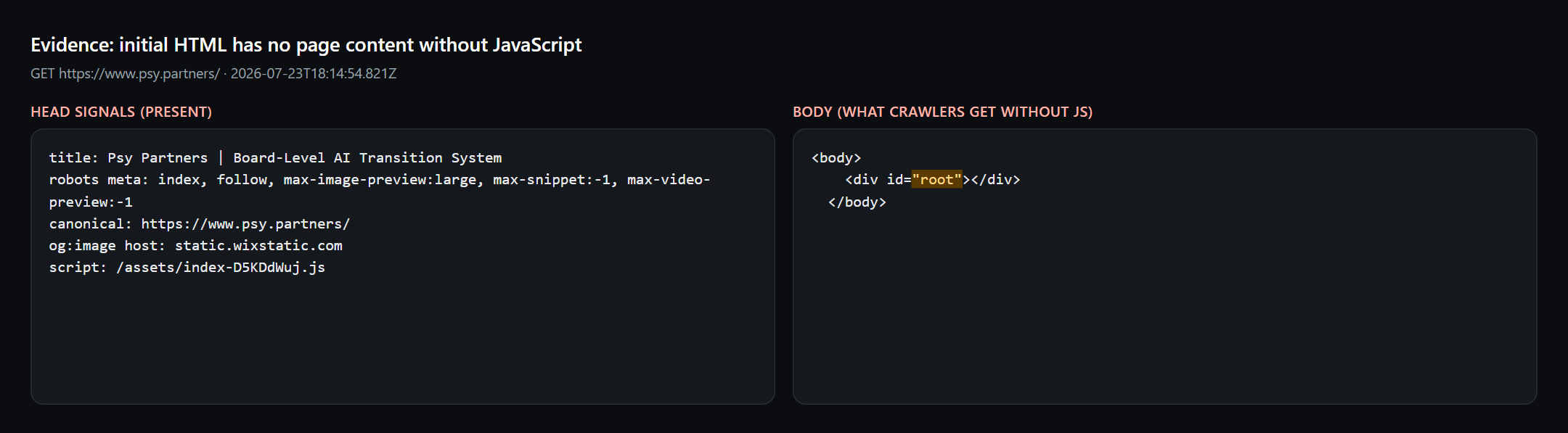
LinkedIn About: AFP · ATRP · BAP
5. UI / UX (website)
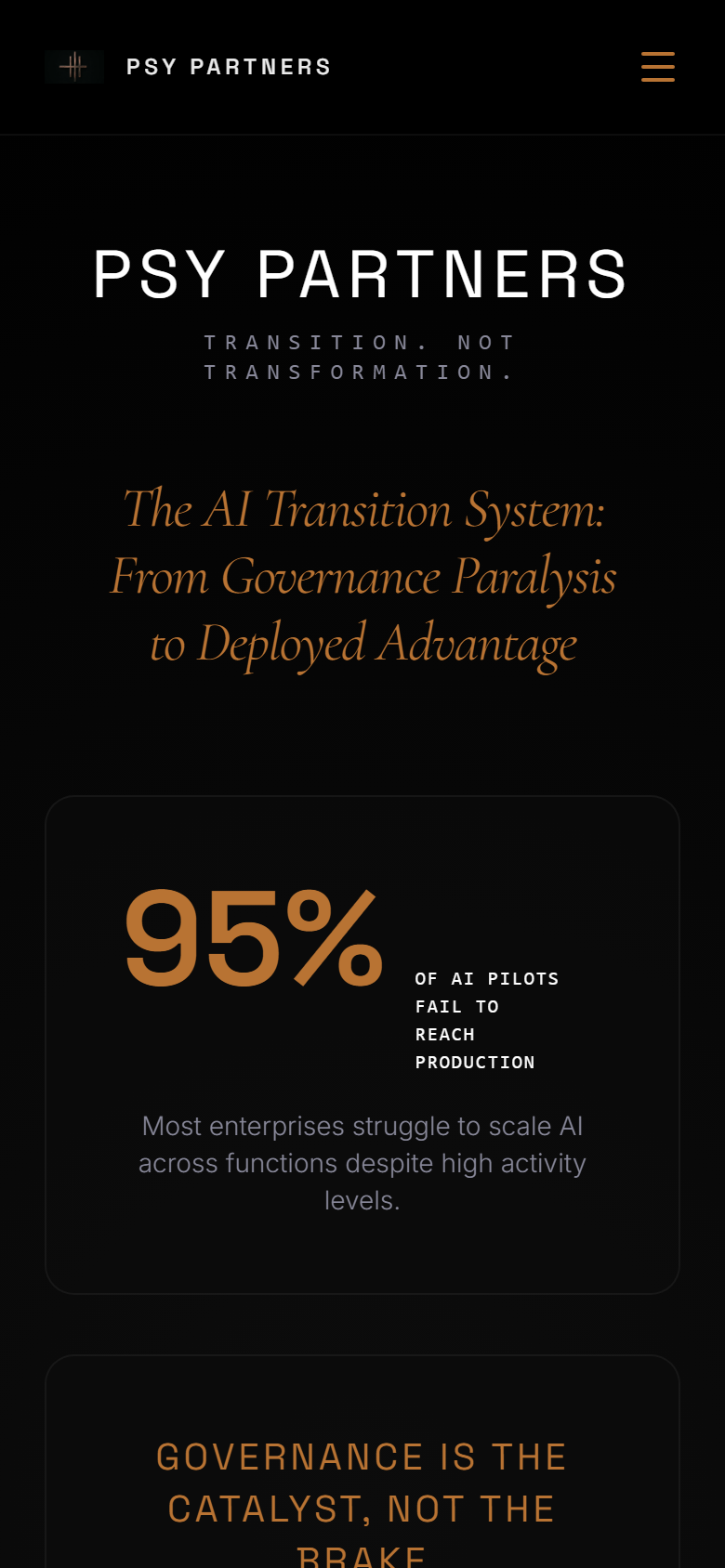
The brand feels premium. The main risk is legibility — thin type and soft grey on black make busy directors work harder than they should.
What’s working visually
- Dark + gold reads “serious firm,” not startup meme
- Clear program pages (BoardGuard / Transition / Velocity)
- Mobile layout stacks — structure is fine
- One primary CTA (“Inquire”) — not cluttered with buttons
What to fix (priority order)
- Hero italic: too thin on black — thicken or switch to sans
- Body contrast: grey → near-white; size ~16–18px
- Nav: larger, heavier, easier to hit
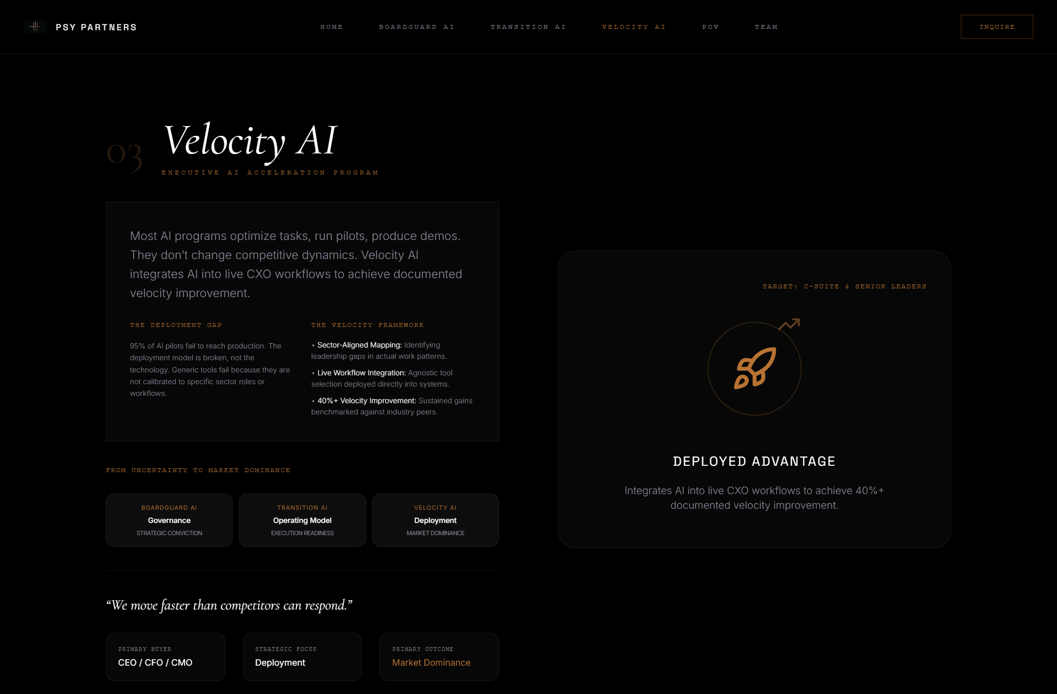
- Dense columns: Gap/Solution micro-type on program pages
- Proof: partner photos are on Team — still add logos or anonymized outcomes so claims feel grounded
Simple design checklist for Psy
- If you can’t read the headline at arm’s length on a 14″ laptop, it’s too thin.
- Body text should pass a quick “squint test” — soft grey on black usually fails.
- Keep the gold accent; use it for labels and CTAs, not for long paragraphs.
- “Inquire” button: fill or stronger border — outlined gold can vanish on some screens.
- One hero idea per viewport; don’t repeat “PSY PARTNERS” twice in the first screen.
Okay Secure + domain
HTTPS on. Contact: info@psy.partners. Domain registered Feb 2026, renews Feb 2027 (Cloudflare + GoDaddy).
Watch Big outcome claims
“40%+ velocity” on Velocity AI — keep only if you can back it with proof beside the number.
6. Reach & LinkedIn
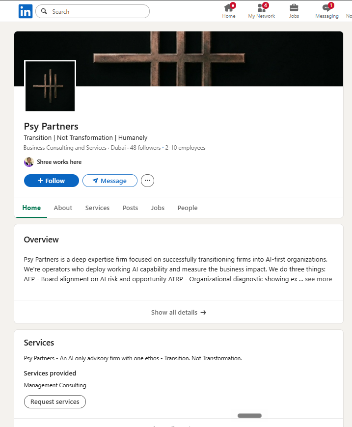
Logged-in LinkedIn company page + full recent post set. No meaningful Instagram / X / YouTube under Psy Partners — LinkedIn and the website are the whole public surface.
LinkedIn — what’s working
- 48 followers · size 2–10 · Dubai · founded 2026
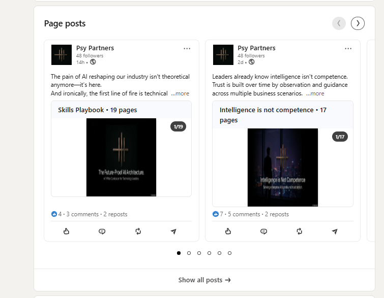
- Posts regularly — often multi-page decks (17–21 pages)
- Clear themes: Transition, governance, trust, boards
- Partners show up in comments and tags (Akshay and others)
- For 48 followers, comments/reposts are decent (people in the circle engage)
LinkedIn — what’s not
- Most posts still get single-digit likes
- About says AFP / ATRP / BAP — site says BoardGuard / Transition / Velocity
- Posts point people to the site, but site POV pages are thin
- Follower count barely moved (~47→48) despite months of posting
- No second channel (IG / X / YouTube) to catch spillover
Google / web
- Domain ~5 months old
- Public search footprint minimal
- Broken robots/sitemap make discovery worse
Content arc (~4 months)
- Months 3–4: Mostly reposts from the partner circle (Rio AI, Akshay, ALRigs) — shared formula Context + Depth + Velocity²
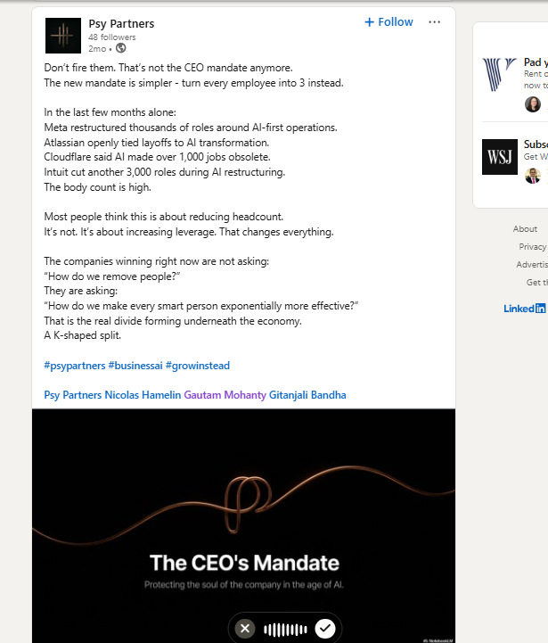
- Months 1–2: Original Psy posts — CEO Mandate, Context is King, Sovereign Moat, K-economy, Tale of 3 Cities
- Now: Board / governance playbooks + long carousels
- Almost every post tags partners (Shree, Gautam, Nicolas, Gitanjali…)
What this means — and what to do
- Keep: The thesis (humans as context, Transition not Transformation, boards need clear AI oversight). Dark brand + multi-page decks look like a serious firm.
- Keep: Warm circle (Rio AI / Geetika, ALRigs, Akshay) — comments prove the network is real.
- Fix: Posting more on the company page alone won’t grow reach. Partners post personally → company reshare.
- Fix: One naming system everywhere (site + LinkedIn About + post titles).
- Fix: Pick 5 strongest posts and turn each into a permanent page on psy.partners — LinkedIn posts disappear; site pages don’t.
- Choose a lead tone: Board / oversight posts (“Clarity Over Chaos”) vs broad human-anxiety posts (“Steady Hearth”). Both can exist; one should lead client conversations.
6b. LinkedIn format — long essays vs what actually scales
Shree’s question: the posts are intellectual and long — do you need a different format? Short answer: keep the brains, change the packaging mix. Top B2B operators on LinkedIn are not “better writers of 800-word walls.” They win on hooks, length discipline, faces, and personal profiles.
What you’re doing now
- Long text posts + 17–21 page document carousels
- Heavy partner tagging
- Mostly company-page publishing
- Intellectual density high — scroll-stop low for cold viewers
What “people killing it” usually do
- Personal profiles first (company page = archive / stamp)
- Hook in line 1–2 before “…more” — then depth
- Carousels 7–12 slides, one idea per slide (21 pages rarely finish)
- Mix: short text · carousel · talking-head / screen video · single quote card
- Face on camera once a week beats another anonymous essay
- Don’t throw away long-form. It’s your moat. Just stop making the feed do the job of a white paper.
- Format that fits Psy: “One board question” carousels (8 slides), “3 numbers that matter” posts, partner POV videos answering a regulation headline.
- Comment strategy: reply to every comment in 1–2 hours for 24h — that is free distribution.
- Not required: meme templates, daily posting, or influencer growth hacks. Required: shorter packages + partner faces + site landing pages.
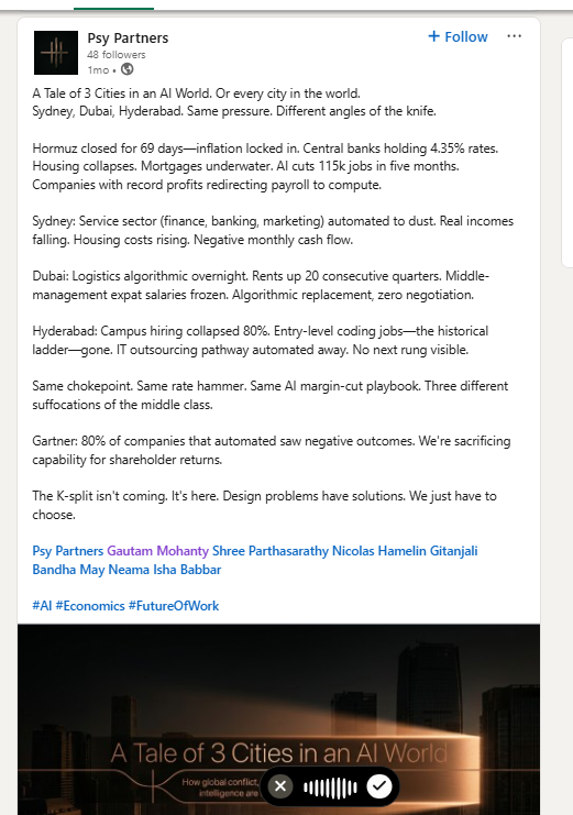
Extra LinkedIn frames (full dump) sit in evidence/linkedin-posts/.
Google/Bing UI captchas were tooling limits — not used as site evidence. Confirm indexing in Search Console after P0 fixes.
7. What to do
Fix robots.txt + sitemap + favicon
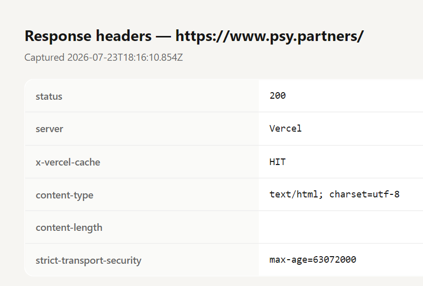
Serve the real files — not the homepage HTML. One hosting config change.
Make key pages readable without JavaScript
Home, 3 programs, Team, POV should show text in “View Source.” (Prerender or SSR.)
One naming system everywhere
Either BoardGuard/Transition/Velocity on LinkedIn too — or show AFP/ATRP/BAP on the site with a clear map.
Readability / UI pass
Thicken hero type (or drop hairline italic), raise body contrast, enlarge nav, fix micro-columns on program pages. Test at 390px width.
LinkedIn format mix
Keep the intellect; shorten the package. Weekly: short posts + ≤10-page carousels + one face-to-camera. Put 18–21 page papers on the site and link out.
Add 3 proof pages
One sector brief, one outcome story, one method one-pager — then link them from LinkedIn.
Lead with partner LinkedIn, not the company page
At 48 followers, personal posts + company reshare beats company-only posting.
Turn on Search Console
After P0, submit the sitemap and watch what Google actually indexes.